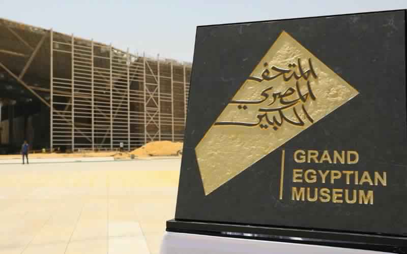
The newly released logo for the Grand Egyptian Museum has caused contention amongst artists, archaeologists, architects and the general Egyptian public alike.
The logo was released on Sunday under the supervision of the Minister of Antiquities and the Minister of Tourism.
As the cultural project of the century, it is no surprise that the logo design has come under fire. Critics of the logo are angry at the graphic designers for not preserving and doing the Egyptian identity and history justice.
Tarek Atrissi Design, an award winning graphic design studio in the Netherlands specialised in Branding, was commissioned to develop the core branding of the new Egyptology centre in collaboration with Atelier Brückner, a German company.
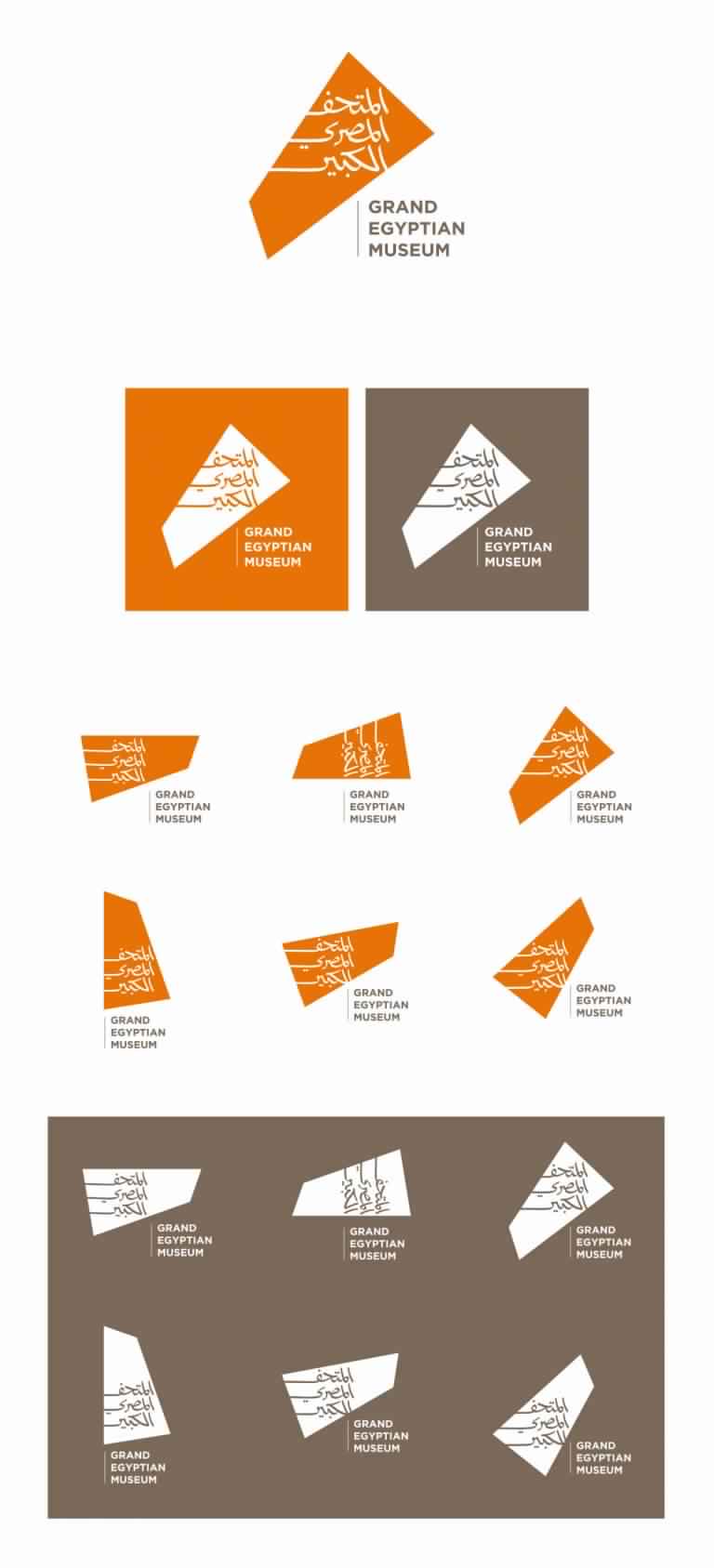
The logo design has been said to be inspired by the unique shape of the building as well as its environment and surroundings. Atelier Brückner offered several different design proposals to the committee, some containing traditional Pharaonic icons such as amulets and pyramids, however the committee chose an abstract form, supposedly to conform to marketing trends attempting to engage younger generations.
Tarek Tewfik, General Supervisor of the museum, told Ahram Online that the logo, “reflects the unique footprint of the Grand Egyptian Museum complex in an orange colour, conveying the warmth of the evening sun which imparts this colour to the sandy landscape before settling in the west behind the museum”.
He also added that the Arabic script is intended to evoke images of the sandy dunes and peaks of Egypt whilst the simplicity of the design is on par with famous international museums such as the Louvre, the British Museum and the Metropolitan.
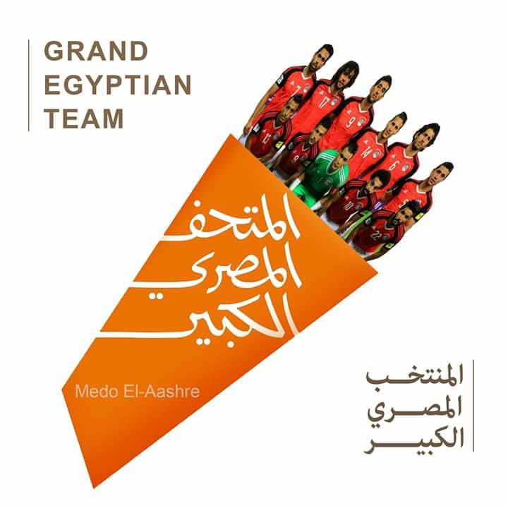
However, Egyptians have taken to social media to mock and criticise the campaign, eliciting a variety of fast-food and football-themed memes.

Mohamed Abla, an artist, told Ahram Online, that the Ministry of Antiquities should have launched an international competition for the logo design. He added that the winner and their family could have been rewarded with free accomodation in Egypt as well as free access to the museum for a month instead of a monetary reward.
The Arabic Society for Fine Art Designers released a statement saying the logo is not compatible with the principles governing effective design, nor does it pay homage to Egypt’s rich and ancient civilisation.
The society also offered to organise an international and local competition amongst arts and graphic companies to select a new logo for the Grand Egyptian Museum.
However Dalila El-Kerdany, a supporter of the logo and Professor of Architecture at Cairo University told Ahram Online, “All of France was against the Eiffel Tower France, describing it as an ugly structure that didn’t reflect French identity and spirit.”
Instead she added, “I am really happy that such controversy has arisen: it’s good publicity for the logo.”
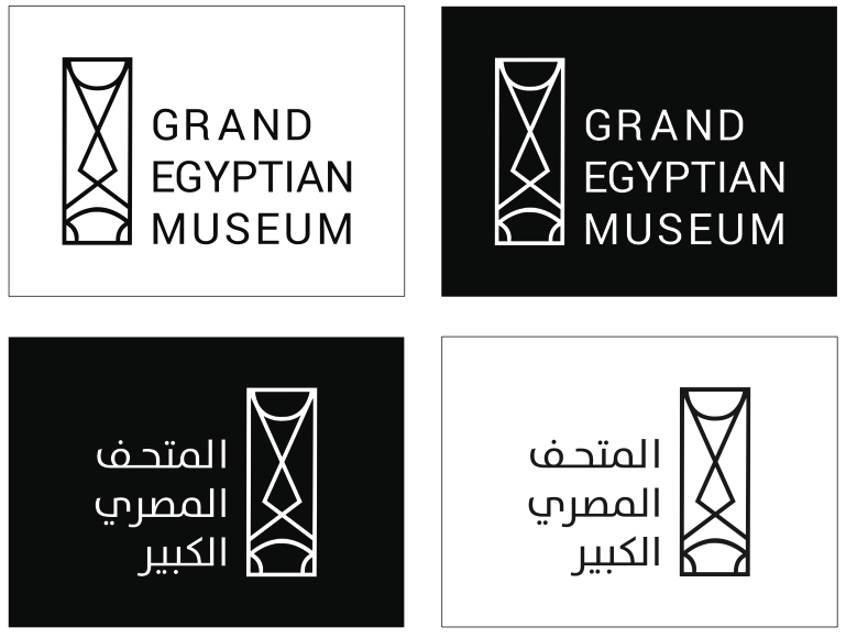
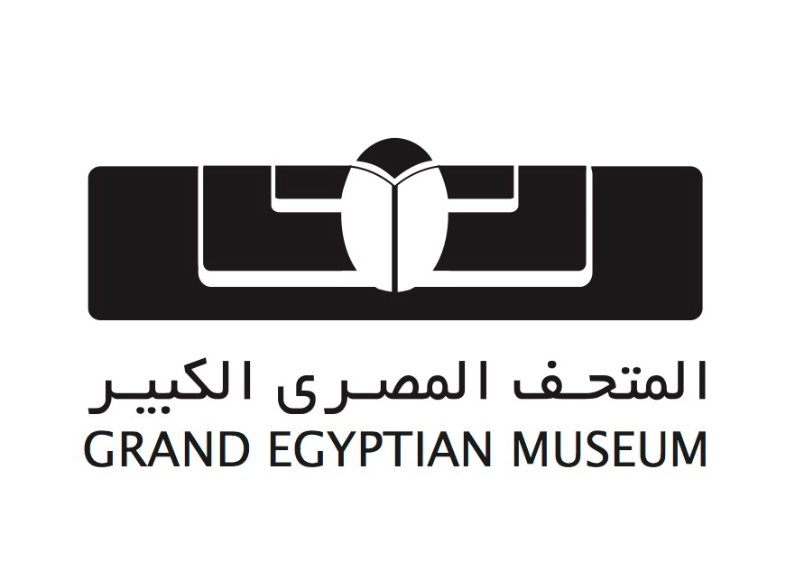
That being said, criticism of the logo has brought some of Egypt’s most renowned designers to create alternative designs incorporating hieroglyphs as well as scarab beetles.






Comment (1)
[…] https://egyptianstreets.com/2018/06/13/grand-egyptian-museum-logo-causes-controversy/ ================================================================ THE TECHY SIDE […]